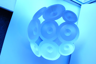
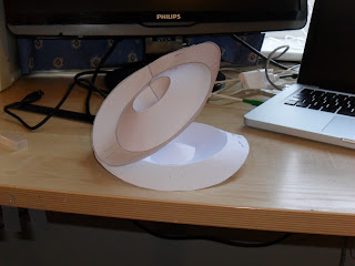
Rather than being and isolated object on my poster the form I produced was designed to be used as an element of the type for my poster. I had to merge 3 photos of each individual form to get the desired image I wanted as the images with all 3 forms on weren't sufficient.
Monday, 14 March 2011
Task 2 Photos
With Richard Sweeney's help I attached the forms using string to a broom which we then dangled over the infinity background.
Task 1, Take 2!
Due to the flimsy production of my first attempt I decided to attempt to connect the circle forms together. When experimenting with doing this I found that when joined the repeated connection between the forms created a dome shape. Much like the repeated shapes in the hubs. This led to me thinking of producing a globe shape. This would produce some nice shadows around the form when placed in the bright natural lights drawn in in the atrium.
Once again I formed the individual circles....
Next I began to connect the circle forms to begin the dome shape...
Finally I ended up with a globe shape....
Task 1 Production
1. I started by drawing out the individual sized circle templates.
2. Next I cut out and scored each circle.
3. I then formed and stuck each one.
Finally I connected the circles in the desired sequence with string.
Unfortunately, the final product didn't come out how I wanted as the piece was flimsy and crooked so I decided to re-design the form.
Thursday, 10 March 2011
Task 2 Production
The day had come to start production of my final form for task 2. Once again I started by cutting out the circles and scoring them to the template I used in task 1. One positive with this one was that there was only to variations and sizes needed for the second one as this was all that was needed to produce the desired shape.
Once I had produced all of the shapes I then went onto connecting them all with glue and tape. Beginning with the 0 shapes 9 ofthe circles were connected to form the shape.
I think this came out really well and I love the way that when you shoot it from different angles it gives a sort of optical illusion of whether the form is doming inwardly or outwardly.
Now I need to photograph the it. I have booked a studio to do it properly tomorrow......
Task 2 Experimentation
Using the circular form I am going to use for the final product I tested connecting a number of these and how they would react when connected.
I noticed that due to the slanted edges of the forms that when they were connected they began to dome inwards. Although I didn't compensate for this in my design I felt this would give another dimension to the piece that would work really well when photographed and how the light will react to it will give some nice shadow.
Task 2 GF Smith Research
GF Smith are a well established company amongst any print or graphics based businesses. Based in Hull they were established by Mr George Frederick Smith. They pride themselves on producing high quality paper with a huge range of colors and sizes.
I started my research by writing to GF Smith and asking for some samples to give me an idea of the range of papers they have and if some how I could incorporate these into my designs.
In response to task 2 I wanted in some way to see how i could develop my task 1 piece into my Task 2 design. Therefore, I wanted to use the circle form and develop it into Task 2.
I noticed that the lines produced on the edge of my Task 1 piece could form the outline of words or numbers such as 100.
This led me to thinking of ways to emphasize the number 100 as part of the 100 years as part of my form to lead into the poster design.
I found that the problem with this design was that from certain angles it wouldn't be clear what the form was portraying.
The design I decided on was one which connected the circles to form the 100 shape. Rather than having the circles handing off something like a piece of string as in my Task 1 piece they were directly connecting with glue.
Task 2 Production
I began by doing the painstaking job of cutting out the numerous circles and scoring them to this template.
"I would have to choose the hardest shape to cut out"
I then started to shape the forms making sure to keep all the forms the same to keep the repeat element as consistent as possible.
I then thought about the best way in which to connect these to produce my desired form. I decided on using string or ribbon of some kind as I didn't want to use some kind of tube in the centre as this would restrict the movement of the sculpture.
Task 1 Design Ideas
When thinking of a design to correspond to Task 1, i thought of how the final product would interact with the atrium where it would be displayed. I began to think of contrasting shapes. This was because I noticed how the atrium was made up generally of straight line forms.
The Hubs is a good reflection of contrasting shapes as from a distance it appears to be a dome shaped building but on closer inspection you can see it is made up of a number of rectangular flat shapes.
After looking at this I decided to go with a more rounded shape to contrast against the angular form of the atrium. Therefore I looked at a form that Richard Sweeney introduced to me in the 3rd workshop.
This form was the basis for my designs and I then began to think of how I could repeat this form to produce a model. So I started looking at repeated circles and how they are used in everyday forms when I thought of electrical pylons.
I noticed in electrical pylons they use a repeated shape to build up the structure and this gives it a lot of strength. The aspect of the pylon which gave me the most interest was the part below:
The circular forms hanging down to connect the wires was the inspiration for my designs. I like the way the concentric circles formed a tube effect which i wanted to use so I experimented with a few design ideas.
Here, I have used photoshop to develop a few designs by re-sizing the circles to create forms out of my concentric circles. I decided to go with the second of my designs because I felt it generated the human body form with the contours created. I felt this design would contrast well with the straight lines of the atrium as there is virtually no straight lines in its structure.
Sunday, 27 February 2011
Julien Vallee Vid
Not much paper form skill involved. Just thought it was a good video.
Julien Vallee....
Juliean Vallee
After reading about an installation he did for Aol in 'Computer Arts Projects' magazine I have taken a big interest in his work.
I like his 3d graffiti style of work using a mix of letter forms and objects.
Man made forms
These are a few forms man made forms which I have taken inspiration from to produce my paper forms.
'The Hubs' has a distinct repeated square pattern to produce a rounded structure...
This knitted wool uses a repeat shape to produce the form.
Subscribe to:
Posts (Atom)


